Gate Butler
스마트 미세먼지 안내 디스플레이 smart particulate matter display / 2019
1 / 6


<
>
한국의 경우 매일 아침 집을 나설 때마다 미세먼지 마스크를 쓰고 나가야 하는지 신경써야 하는 상황이 되었지만 매번 앱으로 확인하는 것이 쉽지만은 않다. 이 점에 착안하여 집 현관문 안쪽에 설치할 수 있는 미세먼지 및 날씨 알림 기능의 IoT 기기인 Gate Butler를 구상하게 되었다. 이 기기는 활동 시간대를 아침(6시~12시), 오후(12시~18시), 저녁(18시~24시)으로 구분하여 기온과 날씨 그리고 미세먼지 예측 정보를 제공함으로써 외출 시 마스크, 우산, 외투 등이 필요한지 판단할 수 있도록 해준다. 맨 처음 Arduino Uno 보드로 출발했던 이 프로젝트는 WiFi 연결을 통해 공공 데이터 오픈 API에서 날씨 및 미세먼지 정보를 받아오기 위해 Arduino Uno WiFi Rev2 보드로 옮겨갔고, 최종적으로는 RGB matrix 32x32 디스플레이로 정보를 표시하기 위해 Adafruit Metro M4 Express AirLift (WiFi) - Lite 보드를 사용하게 되었다.
In Korea, we have to worry about whether we need to wear a fine dust mask every time we go out, but it is not easy to check with a fine dust app each time. With this in mind, I envisioned Gate Butler, an IoT device with fine dust and weather notification function that can be installed inside the front door of the house. This device can help you decide if you need a mask, umbrella, or coat by providing temperature, weather and fine dust prediction information by 3 time slots such as morning(6am~noon), afternoon(12pm~6pm) and evening(6pm~midnight). This project, which first started with the Arduino Uno board, moved to the Arduino Uno WiFi Rev2 board to receive weather and fine dust information from the public data open API over a WiFi connection, and finally, the Adafruit Metro M4 Express AirLift (WiFi) Lite board was used to display the information on an RGB matrix 32x32 display.

Click this image for the video
POSCO Wish Kite
포스코 50주년 임시 조형물 temporal installation for Posco 50th anniversary / 2017
1 / 5


<
>
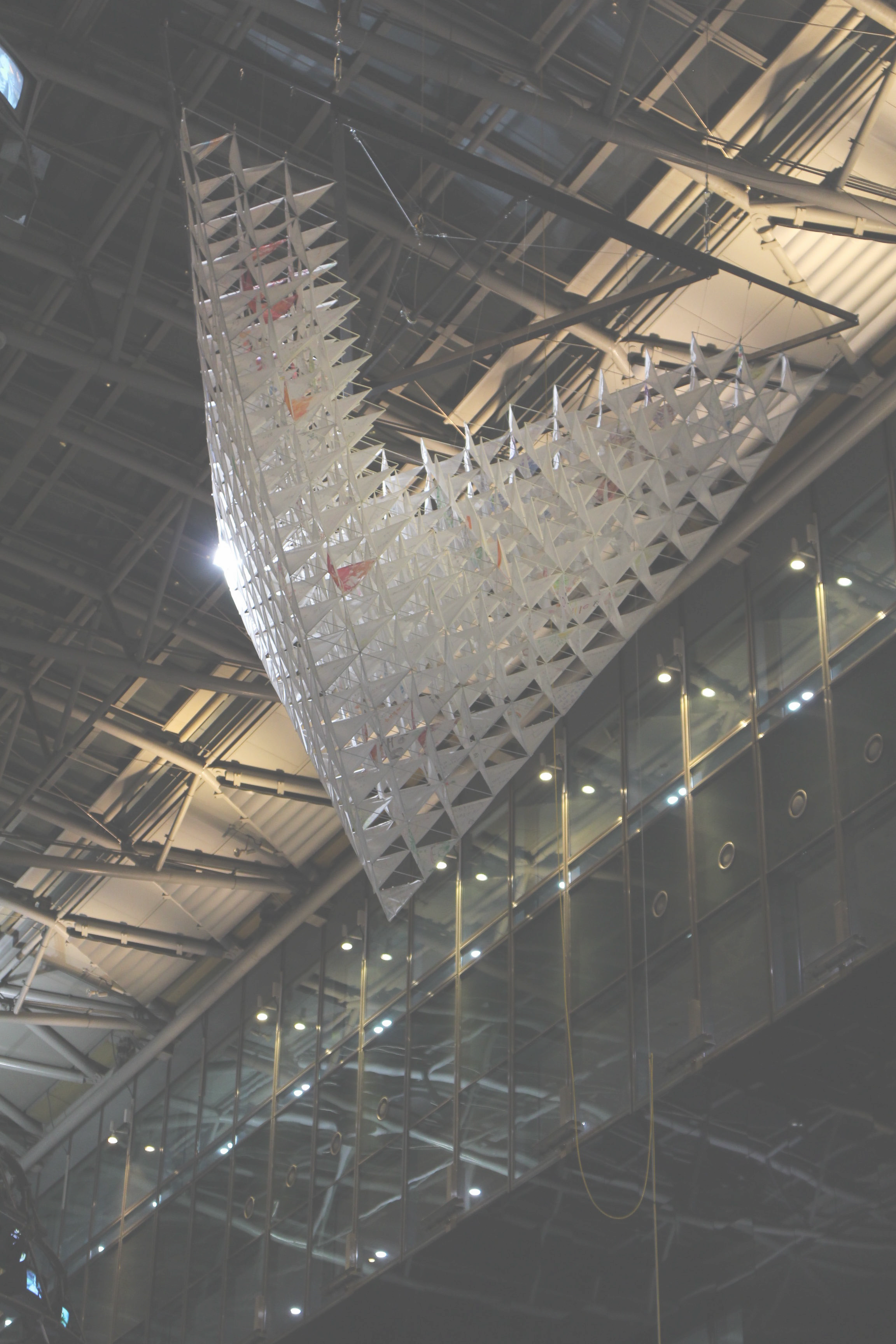
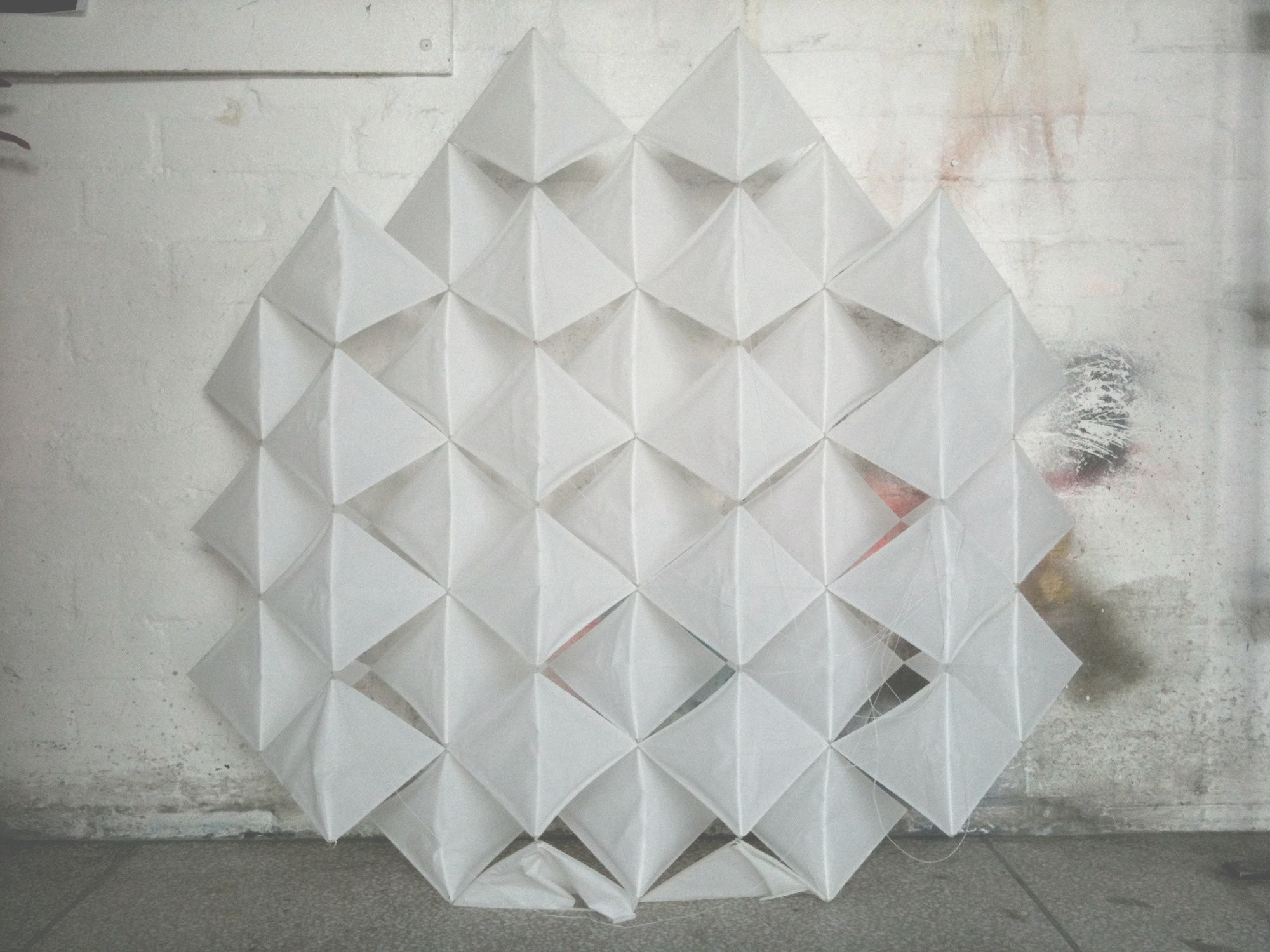
2018년 4월 창립 50주년(600개월)을 앞두고 POSCO 미술관에서 의뢰한 연말 임시 조형물로, 포스코 임직원 및 사내 어린이집 꼬마들이 직접 새해 소망을 적은 600개의 사면체로 구성된 3개의 조형물이 점점 날개를 펼치면서 하늘을 향해 날아오르는 형상으로 만들어졌다. 짧은 기간(2주)동안 디자인부터 제작, 설치까지 촉박하게 진행되어 당초에 의도했던, 진행방향 앞쪽으로 점점 밝아지는 사면체 개별 조명이 적용되지는 못하였다. 삼성동 포스코센터 로비에 설치되었으며 전시 기간은 2017년 12월~2018년 2월이다.
It is a temporary artwork created for POSCO commemorating the 50th anniversary (600 months) of its founding in April 2018. POSCO and its partners’ employees, and the children of its in-house nursery wrote their New Year’s wishes on 600 tetrahedral cells, and three pieces of the artwork consisting of the 600 tetrahedrons were made to rise toward the sky as the wings spread. It will be displayed in the lobby of POSCO Center from December 2017 to February 2018.
Open Kite Gwangju
open kite update for Gwangju Design Bienale 2017
1 / 4


<
>
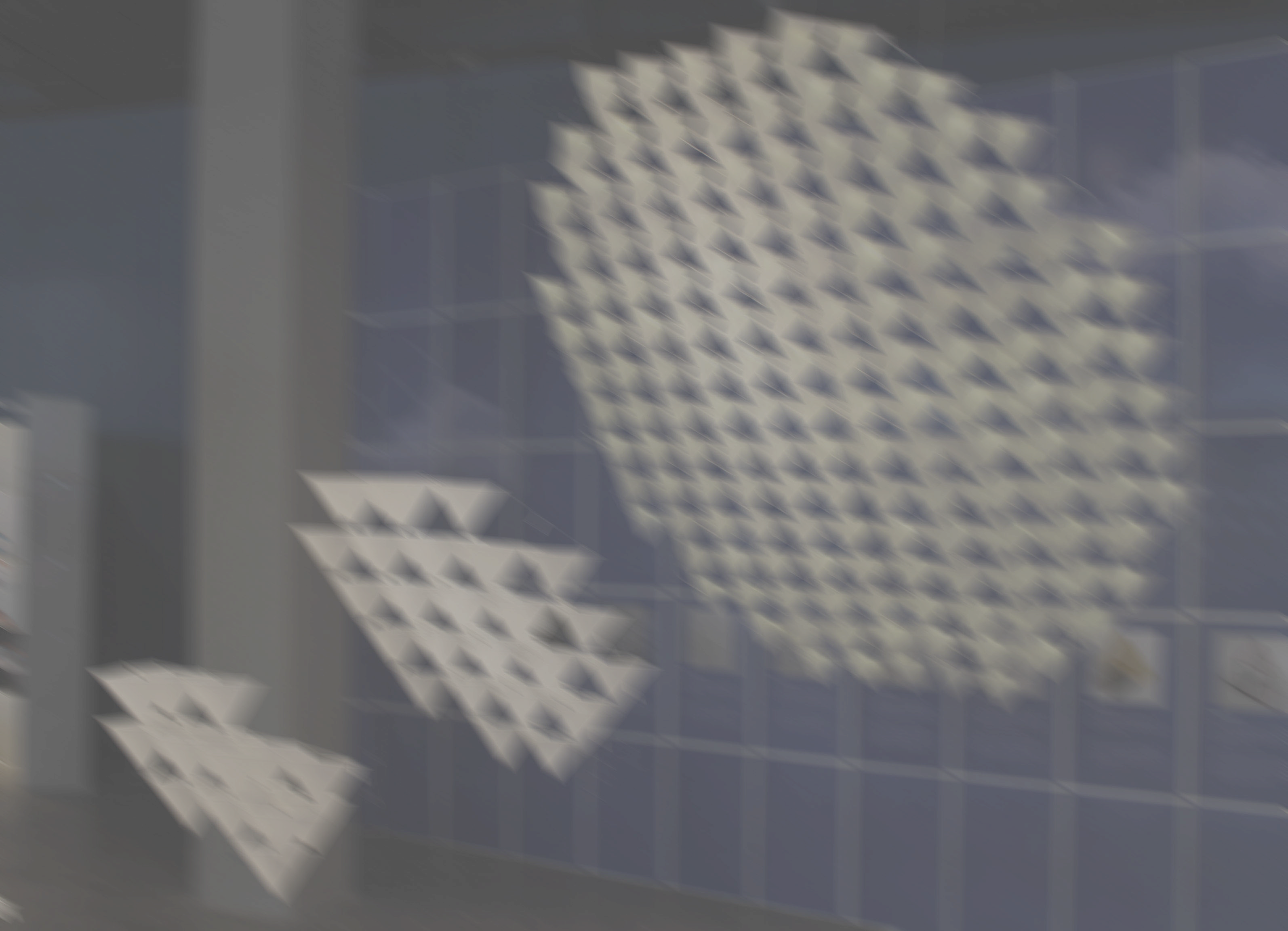
2017 광주 디자인 비엔날레를 위해 새롭게 제작한 2.5m 직경 원형의 11번째 버전 프로토타입은 277개의 cell로 구성되어 있으며 LED 조명도 설치되어 있다. 3D 프린트 된 부품이 조립되고 사면체 구조가 확장되면서 점차 큰 연이 되어가는 모습을 살펴볼 수 있도록 전시되었으며, 설명 영상 속에서 실제로 하늘을 날았던 큐브형태의 9번과 10번 프로토타입도 함께 전시되었다.
The 11th prototype of the 2.5-meter-diameter circular shape prototype made up of 277 tetrahedral cells and LED lights was built for the 2017 Gwangju Design Biennale. Visitors can see how the 3D printed parts are assembled and the tetrahedral structure expands to become a larger kite. In addition, the 9th and 10th cube-shaped prototypes that actually flew in the sky are also exhibited.
O’view
스마트 배란 측정기 smart ovulation tester / 2016
1 / 5


O'view Final Design
Body Shape Studies
Design Type B
Design Type A
<
>
O'view 스마트 배란 측정기는 (주)종로의료기가 대구경북첨단의료산업진흥재단(DGMIF) 산하 의료기개발지원센터의 지원을 받아 2016년 1년여에 걸쳐 개발한, 가임기 여성의 배란 여부를 확인할 수 있도록 해주는 제품으로 2016년 연말에 시장에 출시되었다. O'view 제품은 스마트폰 카메라에 부착할 수 있도록 되어있으며 일회용 검사지에 타액을 묻혀 오뷰 본체에 삽입한 후 별도의 전용 앱을 통해 사진 촬영 후 이미지를 판독하면 지금이 임신 가능한 배란기인지의 여부를 손쉽게 판단할 수 있도록 해준다. 경쟁제품 분석을 통한 디자인 방향 설정, 2가지 디자인안 제시 후 프로토타입 테스트를 통한 최종 디자인 개발, 양산 단계 follow-up, 본체 및 검사지 패키지 디자인 개발 등의 순서로 프로젝트를 진행하였다.
O'view Smart Ovulation Tester was developed by Jongro Medical with support from the Medical Device Development Center of Daegu-Gyeongbuk Medical Innovation Foundation (DGMIF). O'view is designed to be attached to smartphone cameras. After inserting the saliva-stained test sheet into the body of O'view, it is possible to easily determine whether or not this is a pregnancy-capable ovulatory period by taking a picture through a separate dedicated app and analyzing the saliva image. The project proceeded in the order of setting-up the design direction through competitive product analysis, presenting two design ideas, developing final design through prototype testing, follow-up for mass production stage, and design development of packages for the main product and test sheets.
Plumb Modular Furniture
modular approach to increase sustainability in furniture design / 2015
1 / 12


The first set of Plumb Furniture System
Plumb Chair
Dowel connectors and connector couplers
Plumb Table
Plumb Shelf
Chair prototype v.3 with table prototype v.2
Table prototype v.1
Chair prototype v.2
Jointing method tests between dowels and connectors
Chair prototype v.1
Chair prototype v.0.5 (a chair & a highchair)
Variant Examples
<
>
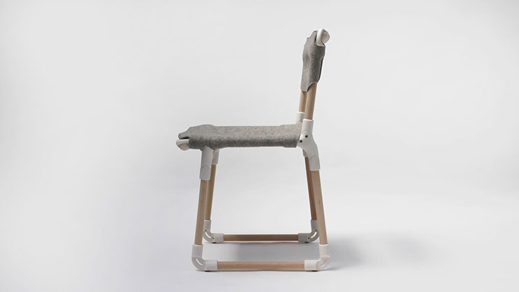
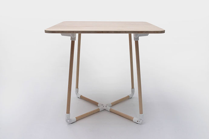
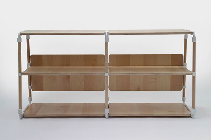
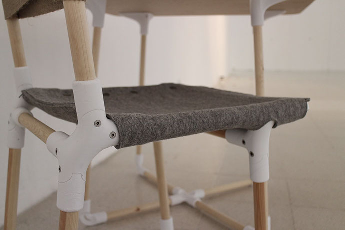
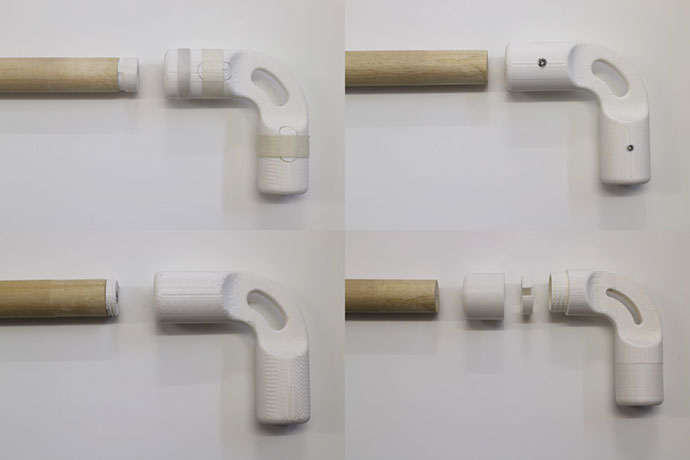
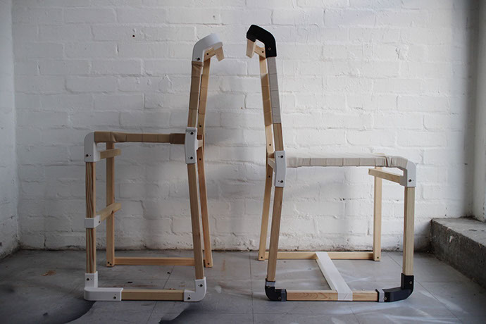
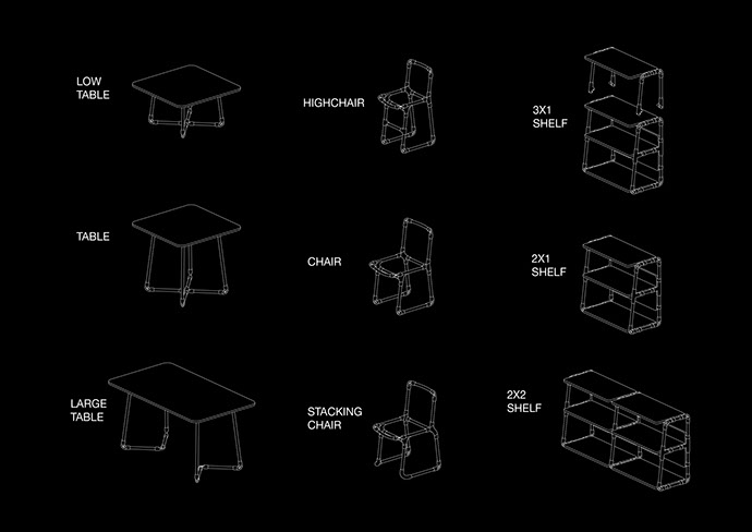
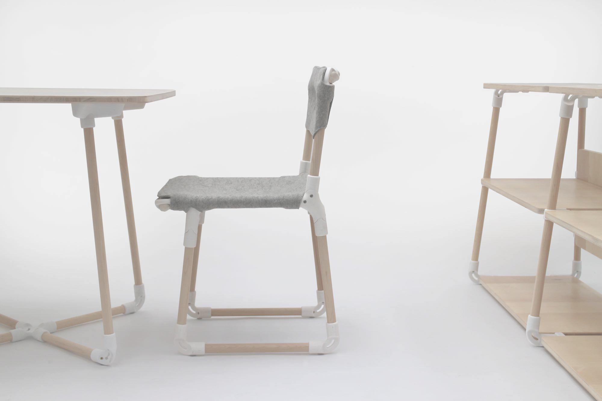
Plumb Modular Furniture system is a set of modular components for building diverse pieces of furniture such as shelves, tables or even chairs. Currently, this system consists of wood structures, plastic connectors and connector couplers. Basically, connectors are universal and can be shared among various structures. On the other hand, connector couplers are dedicated for specific structures. It is a unique solution to find a balance between universality and aesthetics. Users can build various furniture structures and also they can adjust or transform their structures according to the changing situations along with their life cycles. For instance, people can expand their shelves, modify a chair into a children's high chair or they even can transform a table into a shelf by changing some components in this modular system just like they build and modify LEGO structures.
Open Kite
collapsible tetrahedral kite / 2015
13 / 13


Prototype v.9 (63 cells)
Prototype v.7 (41 cells)
Prototype v.7
Prototype v.7 equipped with LED lights for night kiting
Night Flight
Prototype v.6, the first prototype made of 3D printed components
This structure is collapsible
Micro-cell structure test with papers (Prototype v.5)
Soft Prototypes (v.3 & v.4) made of drinking straws
Soft Prototypes (v.1 & v.2) and flight test
3D printing wing components
Cell assembly
Quick tying plug
<
>
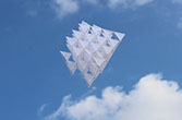
The project brief was about designing a product for play. While I was trying to explore the world of play, I was fascinated by Little Shining Man (Heather & Ivan Morrison, 2011), a huge cube shape kite which consists of hundreds of tetrahedral cells. Originally, Alexander Graham Bell invented this type of kite as a form of airplane about a hundred year ago, and Heather & Ivan Morrison translated Bell's invention into a flying sculpture. I decided to explore this intriguing architectural structure. When I tried to build my early versions of prototypes according to the instructions on the internet, I realised that building tetrahedral kites with drinking straws and tissue papers is quite labour intensive especially when I made it in bigger scale with many cells. So I designed 3D printable components for easier and faster kite building and also during the design process, I found out a way to make the structure collapsible, so that it can be flatten when not in use. Consequently, this tetrahedral kite became a more accessible ‘product’, because now it is easier to carry and store thanks to its collapsible feature.
Suitcase Library
bringing books to the people in parks / 2014
1 / 5


Paper Prototype
Paper Prototype
Paper Prototype
The 1st 1:1 Prototype
1:5 Scale Prototype
<
>
The project brief was about converting an indifferent suitcase into some kind of a vehicle for mobile business or service. In my case, I designed a suitcase sized mobile library. I found that some city libraries, such as Denver Public Library and Helsinki Central Library, run bicycle libraries to broaden contact points with people. I was inspired by those ideas and tried to design a suitcase version of the mobile library to bring books to the people in local parks from local libraries. My plan was providing recent best sellers in physical format and also e-book devices that enable people to access to all the e-book archives of the library. I visited some biggest book stores to check the way they display books, and also interviewed one of the Putney library managers to check if my idea is reasonable. As a result, I designed a suitcase library that carries about 40 physical books and 20 Kindles and can be easily transformed into a book display table.
ShareLock
smart door lock that enables people to share properties / 2014
3 / 3


<
>
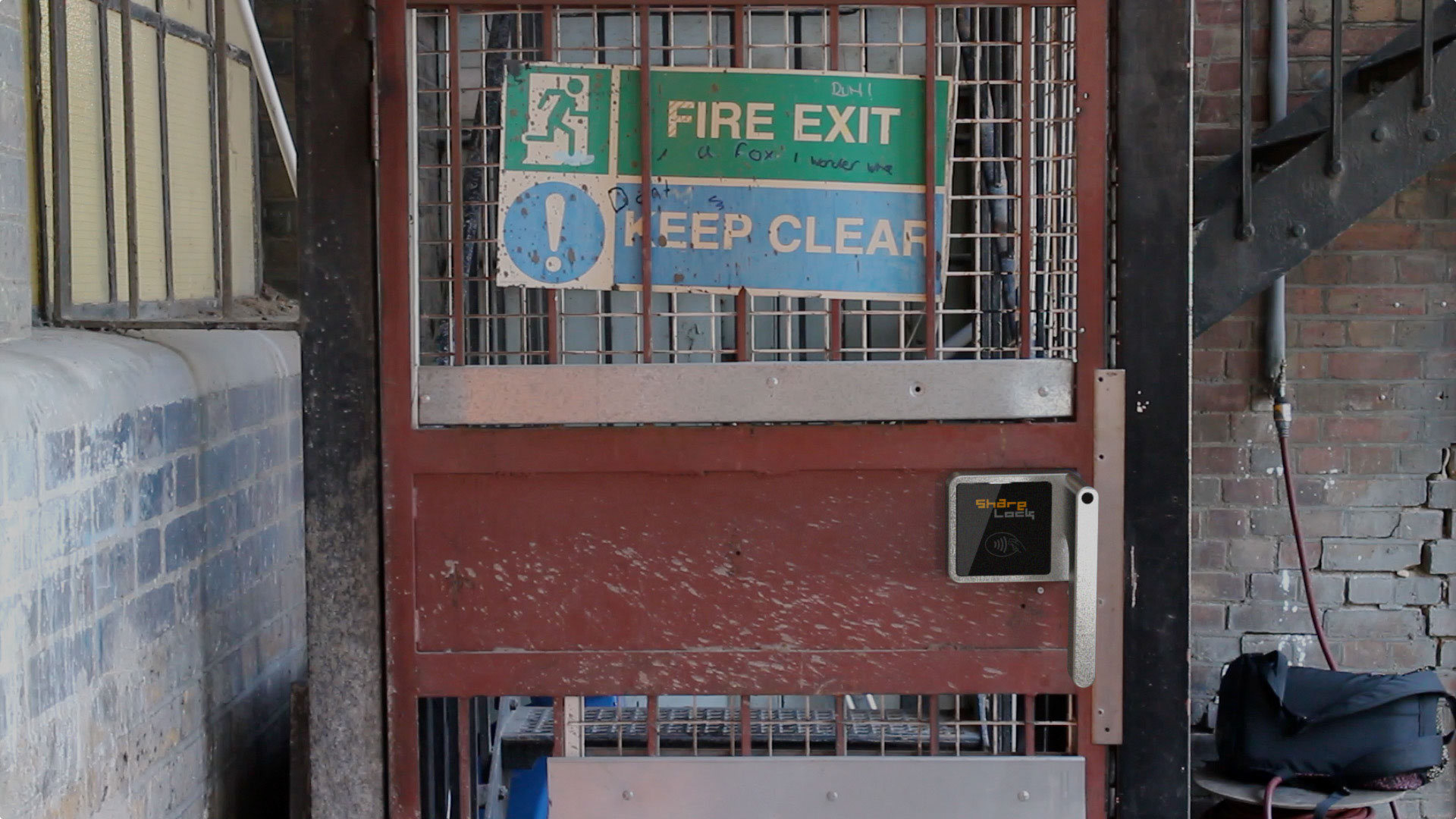
It was a 2.5 week, very short term project for the 2014-15 academic year beginning. For this project, 5 members of our group made a short film about the people's lives in 2020 as a group, and each of the group members designed a specific product that fits in the scenario of the film. Our scenario focused on the emerging trends such as Sharing Economy and Internet of Things, and I designed a smart door lock that is connected to the Internet and enables people to share their properties by the hours. It is a kind of property version of Zip Car. You can check the detailed explanation about the service, ShareSpace and the product, ShareLock with the video link on the right side.
Foodee
smart food organizing system / 2014
2 / 7


Foodee Smart Food Scanner & Kitchen Scale
Foodee Scanner also can be used as an attached type scanner
Once users scan their foods, Fridge Pal app alarms before the foods go bad
The app also recommends recipes according to the inventory
And Foodee Smart Scale guides users step by step
Sketches and Renderings
Soft Prototypes
<
>
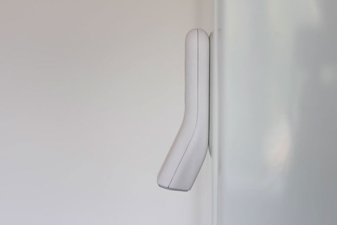
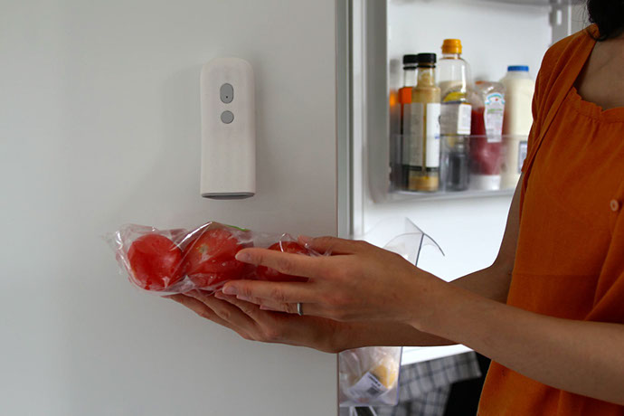
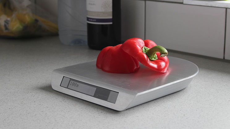
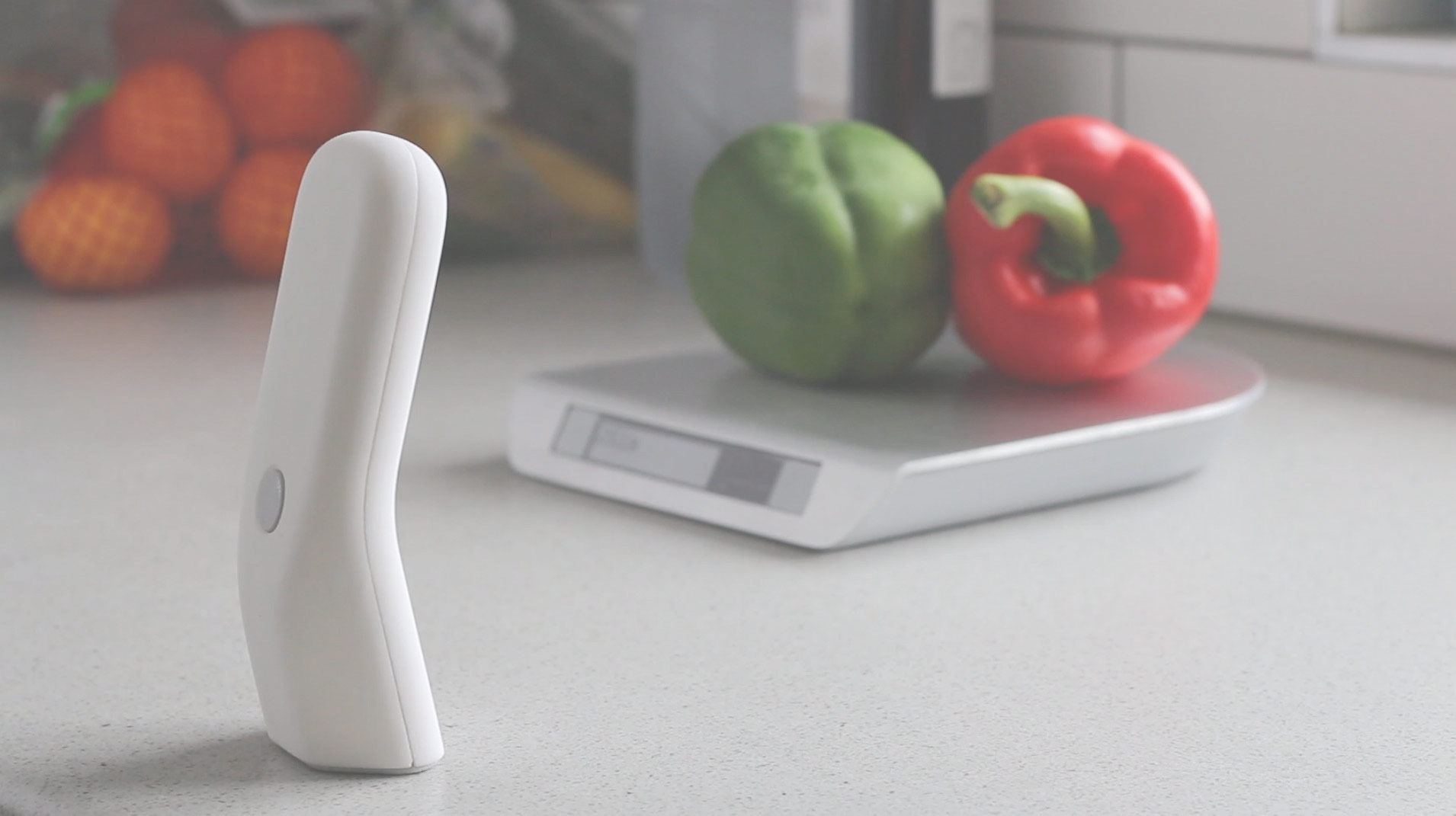
The project brief was designing an electronic device that can add convenience on current online services or apps and also preparing it up to just before the start stage of Kickstarter campaign. In my case, I suggested a kind of smart food organizing system, Foodee, that consists of Fridge Pal-existing smart phone app, a food bar code scanner and a smart kitchen scale. It helps people to get the most out of foods by alarming before the expiration date, suggesting recipes according to the inventory and guiding people cooking steps with perfect portions of ingredients.
Fairer Phone
making Fairphone fairer / 2014
1 / 5


Exoskeleton modular design for the 2nd generation Fairphone
Green modular components can be seen from the bottom
Exoskeleton design makes modular structure more feasible and reliable
Most of the troublesome components are easily replaceable
Structure development with soft prototypes
<
>
Fairphone asked our programme to develop some new design ideas for their 2nd generation product. At the beginning stage of the project, I found out that their current product is not quite fairer than other competitors in terms of the physical design and repairability though they have achieved preferable system in the aspects of sourcing and distribution. Also I thought the trend of modular structure triggered by Fhonebloks is now quite popular among the mobile device developers such as Google and some Chinese manufacturer. Accordingly, I suggested the exoskeleton modular concept as a balance of flexibility and reliability.
Play-In (work in progress)
indoor activity toy / 2014
1 / 7


Rough Prototype (Seesaw Side)
Rough Prototype (Slide Side)
Veneer Laminating Test
Rough Prototype in Use (Slide Position)
Indoor Slide (age 2~4) → Bookshelf (age 5~) : Convertible Concept
Soft Prototype (Convertible Concept)
Soft Prototype
<
>
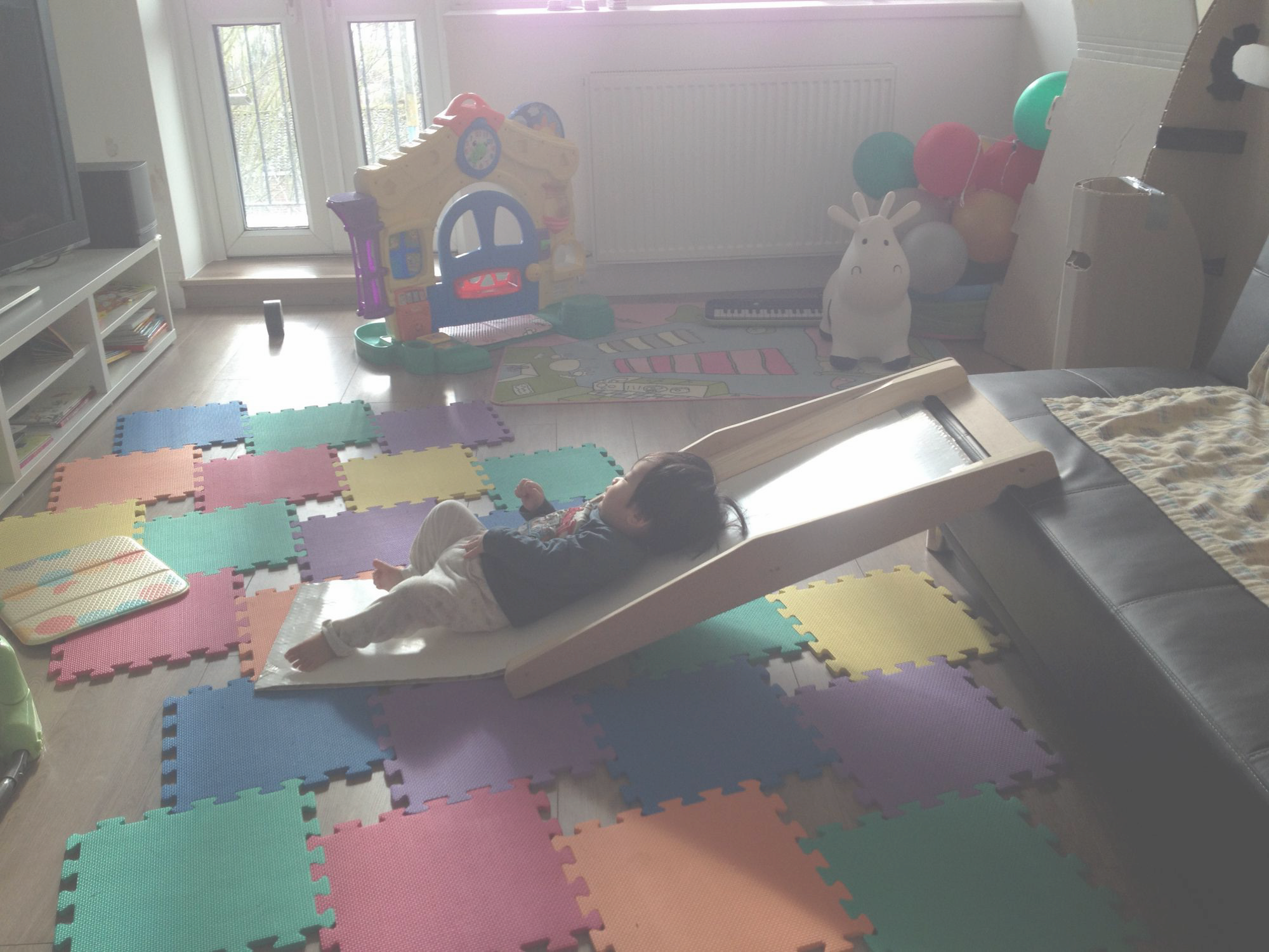
Most of existing indoor slides, see-saws and rockers are made of bulky plastic which is functionally proper but aesthetically susceptible of improvement, unfriendly for the environment and also burdensome for typical compact houses of young families. Accordingly, I decided to design an indoor multi-activity toy that is non-bulky and made of wood. As a result, I made a work in progress prototype that can be used as a slide, a rocker and also as a white board. I also have a plan to make it with a single piece of laminated veneers for the final prototype.
Citro
citrus peeler / 2013
7 / 7


Citro, quick and easy citrus peeler
Steps for peeling
Steps for peeling
Steps for peeling
Prototypes
Prototypes for 'test and improve' processes
Existing Peelers for peeling test
<
>
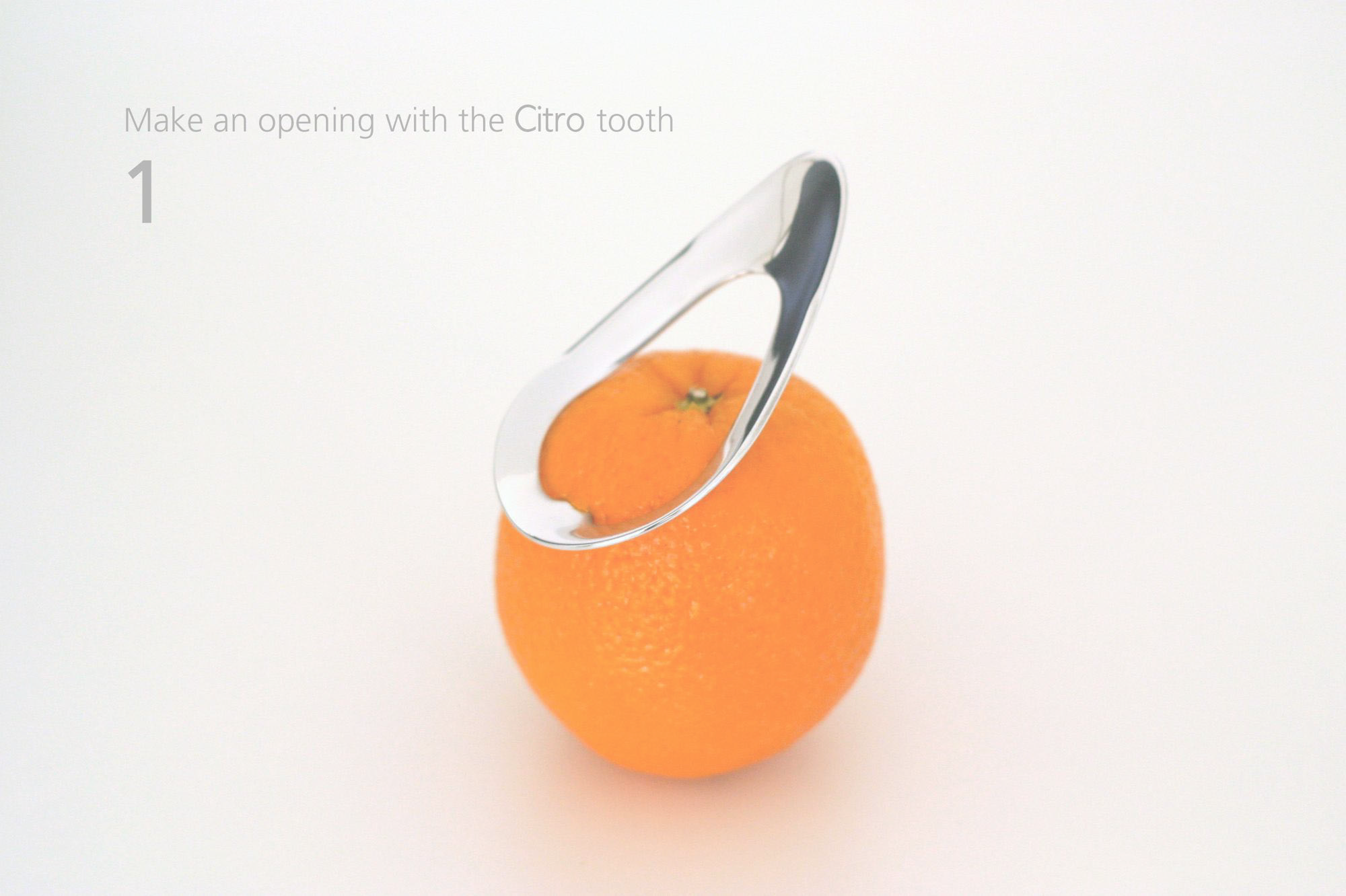
I tested existing peelers and also researched current ways of citrus peeling, and found out that the easiest way so far is using a knife and a spoon. In order to use a spoon, at first we need to make an access opening with a knife, so I started from combining those 2 functions. The first trial with 3D printed prototype was a total failure and I kept trying the make-and-test process with styrene sheet and heat gun. Finally I made a sharp tooth to make the initial opening and also hid the tooth inside the rim because I want it to be safe enough for children as well.

Click this image for the video
Bladeless Mini
hacking an Argos desk fan into the mini bladeless fan / 2013
6 / 6


Redesigned desk fan using the original Argos working components
Bladeless Mini with a flag that visualizes air flow
Idea development into the function of vertical wind direction change
Rough prototype to test the wind direction control
Soft prototypes to understand the relationship between wing shape and wind strength
Disassembly of the given Argos desk fan at the beginning stage
<
>
At the beginning of this project, each of us was given one of three banal household products: a steam iron, a desk fan and a toaster. Our goal was to redesign it after we understand the products physically and contextually. My item was a desk fan. Through the disassembling process and researches about fan types, I decided to change this inexpensive desk fan into the most advanced type : a bladeless fan. Through the process, I also found some possibility of improvement of current commercial product. Instead of tilting the whole body, in this separated two wing design, rotating fins inside the body can change vertical wind direction.
Message Hamper
feast automata for Fortnum & Mason / 2013
1 / 4


Pop-up Message Hamper
Pop-up Message Hamper
Automata mechanism
Fortnum & Mason Picnic Hamper carries messages this time
<
>
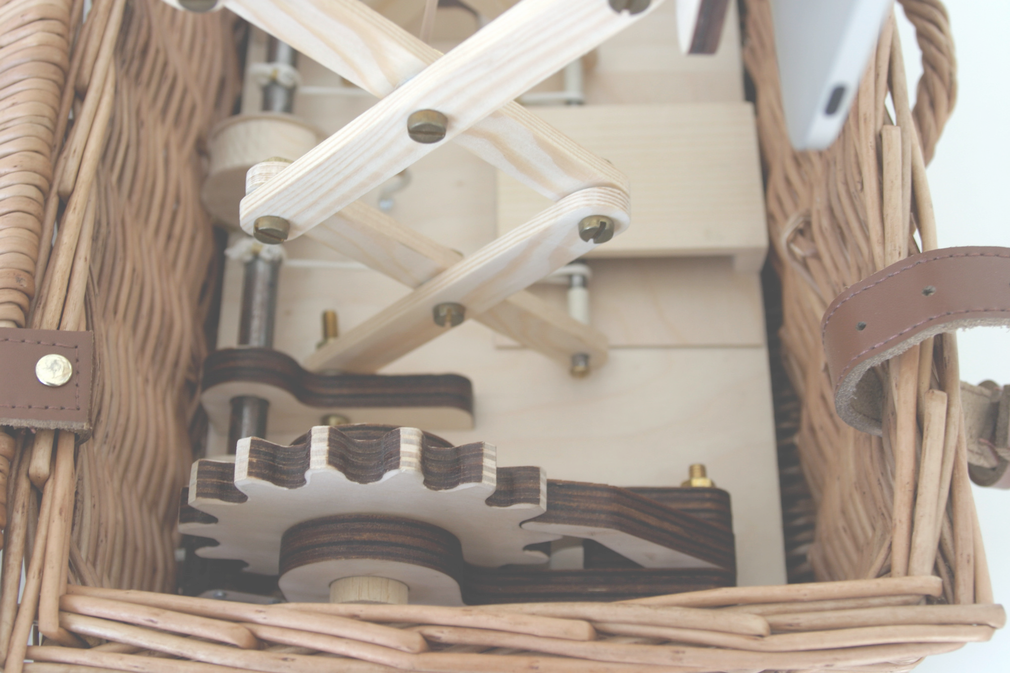
Fortnum and Mason, the time-honoured London based provision store, asked our programme for generating some design ideas of the promotional product, feast automata. I suggested this Message Hamper to combine their most iconic product, a picnic hamper with a type of contemporary messenger for a feast.
Washing Machine
for Chinese market / 2008
Washing Machine
for European market / 2007
Premium Washing Machine
for north American market / 2007
4 / 4


<
>
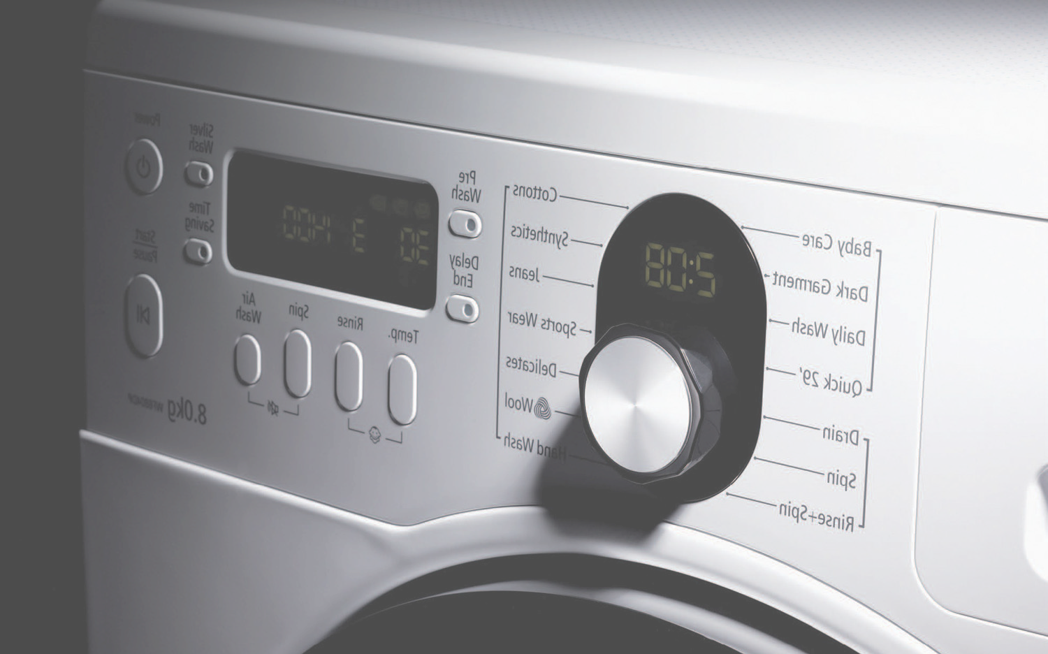
It was the first model of applying Samsung’s dual display concept. Users don’t need to see the right side display for course selection, because it has additional LCD right above the course selection knob. It also has a stainless steel deco strip right below the control panel and it makes strong character that distinguishes Samsung washers from other brand washers.
Built-in Washing Machine
for Korean market / 2007
1 / 2


<
>
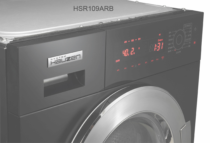
System Hauzen was a Samsung's sub-brand for Korean built-in appliance market, and this washer was designed as a System Hauzen washing machine. As a high-end built-in washer, touch type control panel was applied instead of usual physical buttons and knobs to achieve temperate design language of System Hauzen line. I was in charge of the production follow-up of this project.


